로리키, Brand Identity, 2025.11 - 2026.05
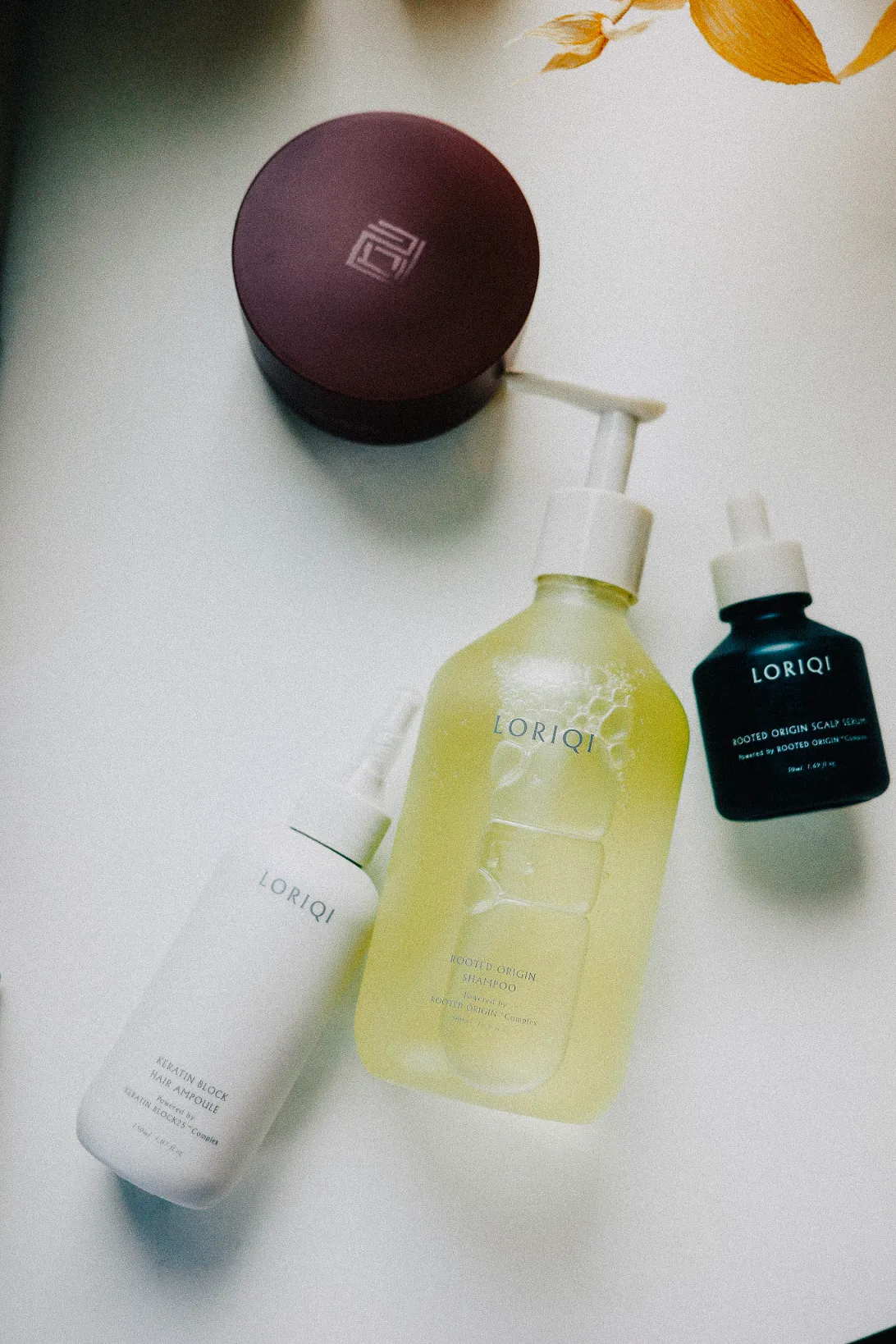
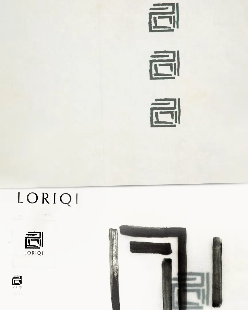
로리키는 두피와 모발의 회복을 설계하는 프리미엄 헤어 케어 브랜드입니다. 브랜드의 철학을 반영하여 한국 처마의 현수곡선 라인을 담은 로고를 디자인하고, 정제된 붓의 텍스쳐로 키비주얼을 표현해 시대를 초월하는 케어의 밀도를 전달했습니다. 브랜드 심볼은 ‘로(露) : 두피를 정돈하고, 리(理) : 구조를 세우며, 기(氣) : 회복된 상태’가 이어지도록 방식을 획의 순서대로 담았습니다. 이는 2016년부터 이어온 브랜드의 신뢰감과 기술 기반의 전문성을 모든 접점에서 전달하고자, 패키지 및 용기 디자인 전반에 걸쳐 적용되었습니다.
LORIQI is a premium haircare brand dedicated to scalp and hair restoration. Inspired by the flowing curve of traditional Korean rooflines, we designed a logo that reflects the brand's philosophy, complemented by key visuals expressed through refined brush textures to convey a timeless approach to care. The brand symbol embodies three principles: Ro (露), cleansing the scalp; Ri (理), restoring structure; and Qi (氣), representing renewal. This visual language extends across the brand identity, packaging, and product design, reinforcing LORIQI's heritage of expertise and trust established since 2016.
Solutions Brand Identity Artwork Print Assets & Digital Assets Art Direction & Brand Direction by Jinnah Keem
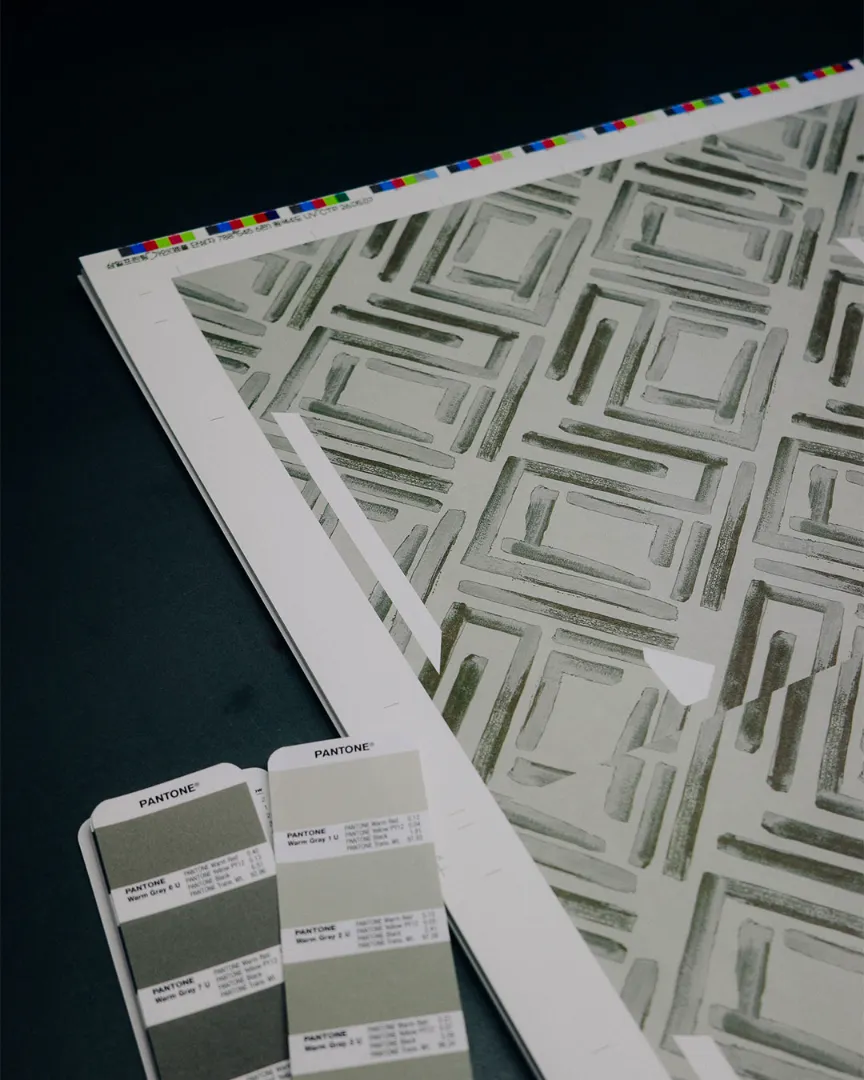
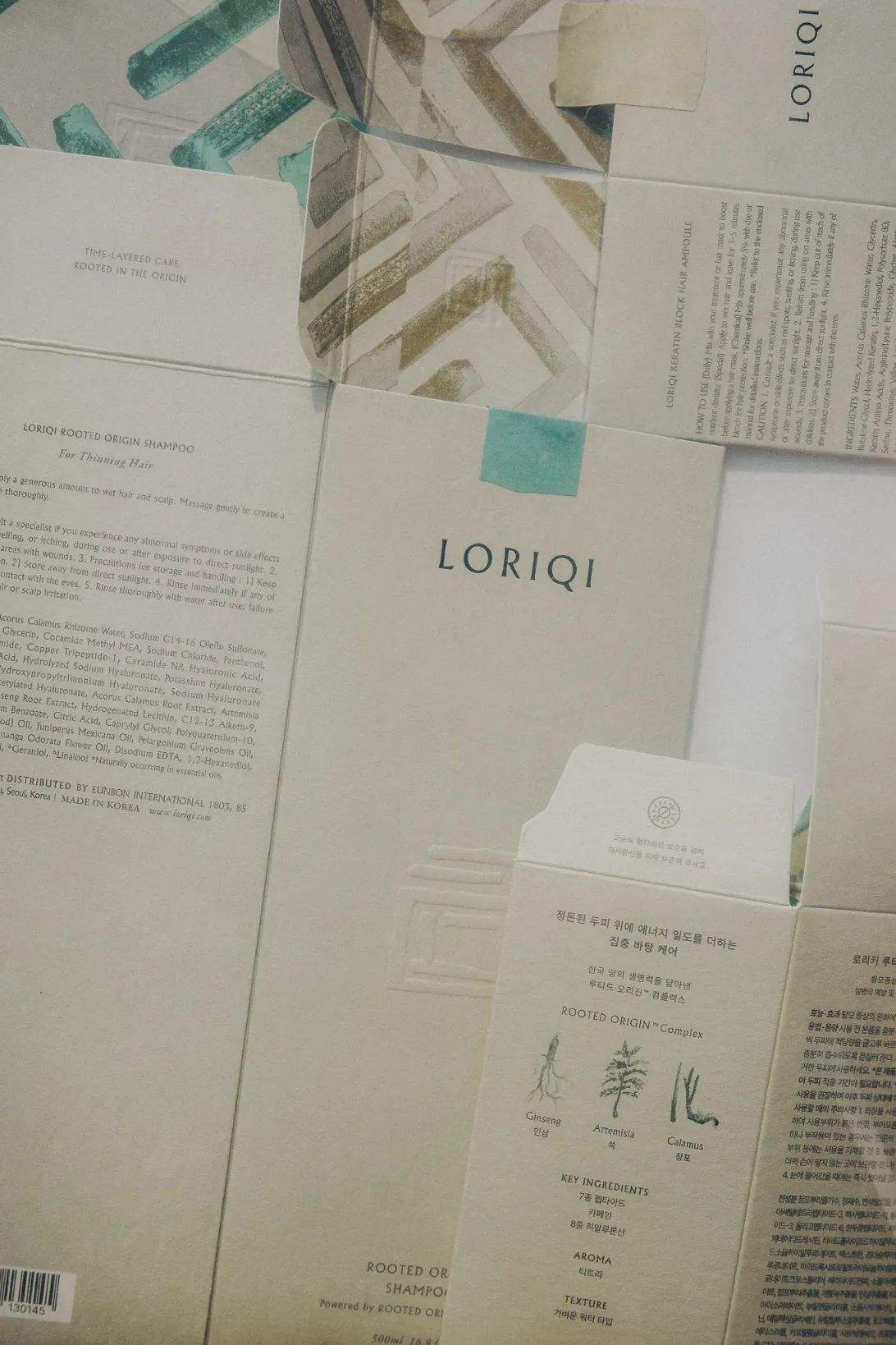
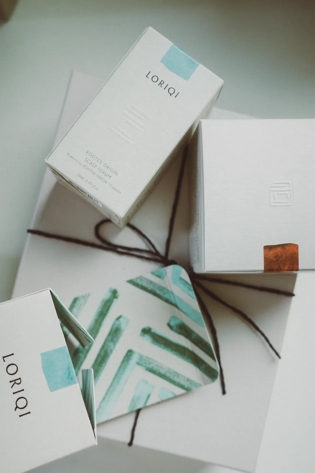
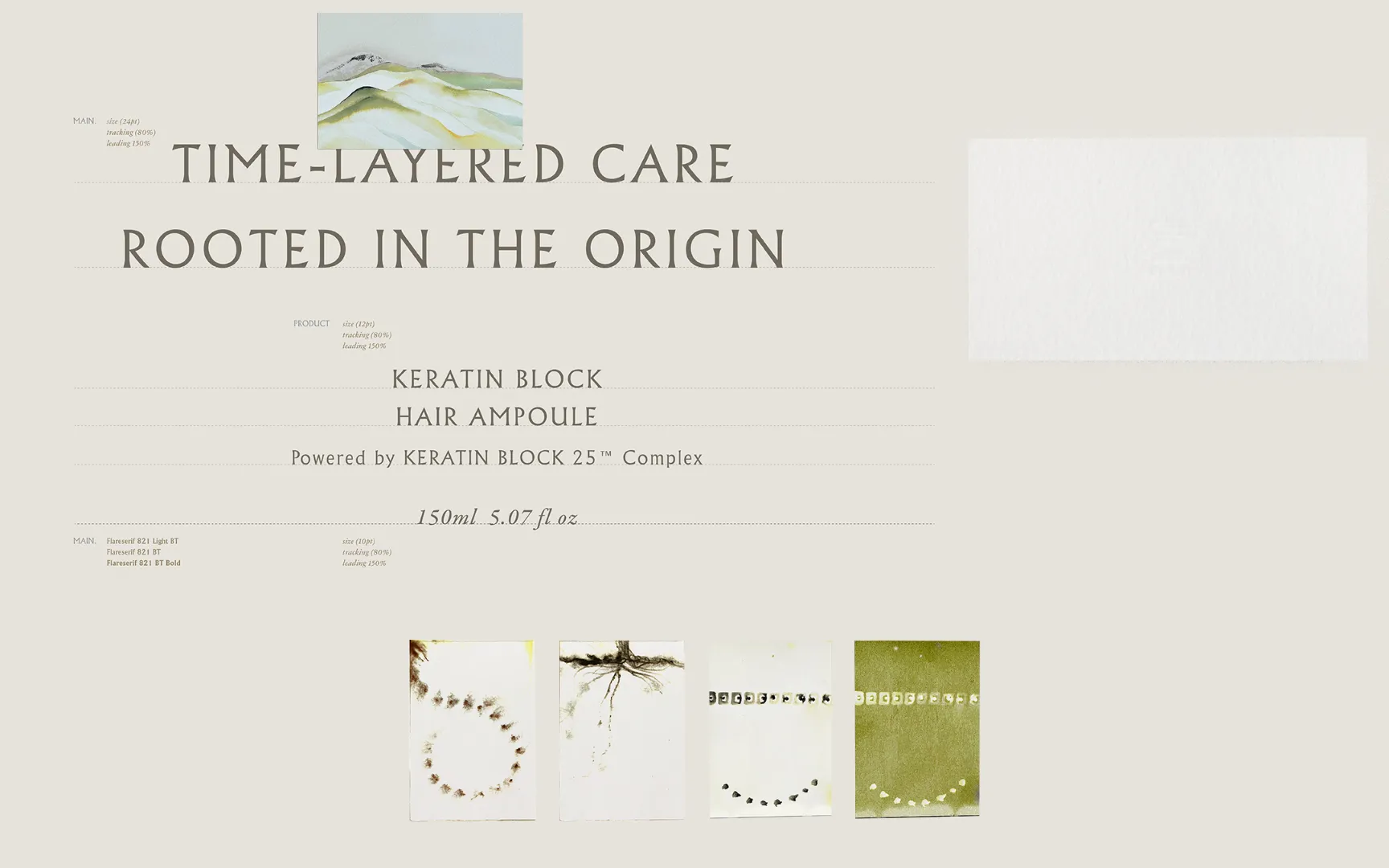
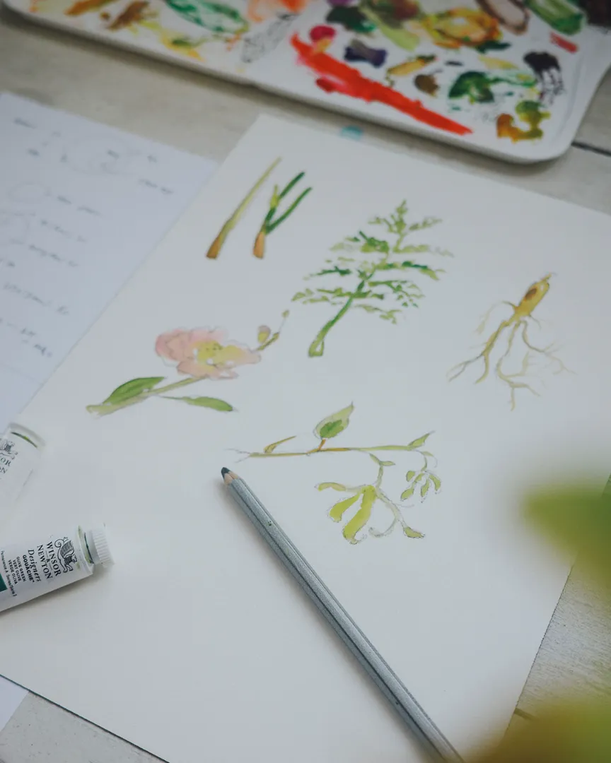
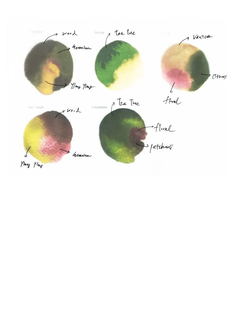
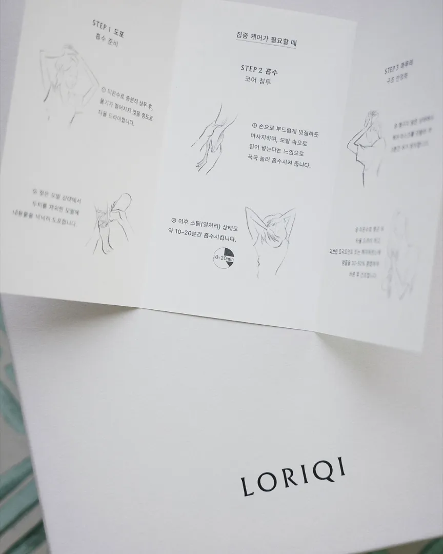
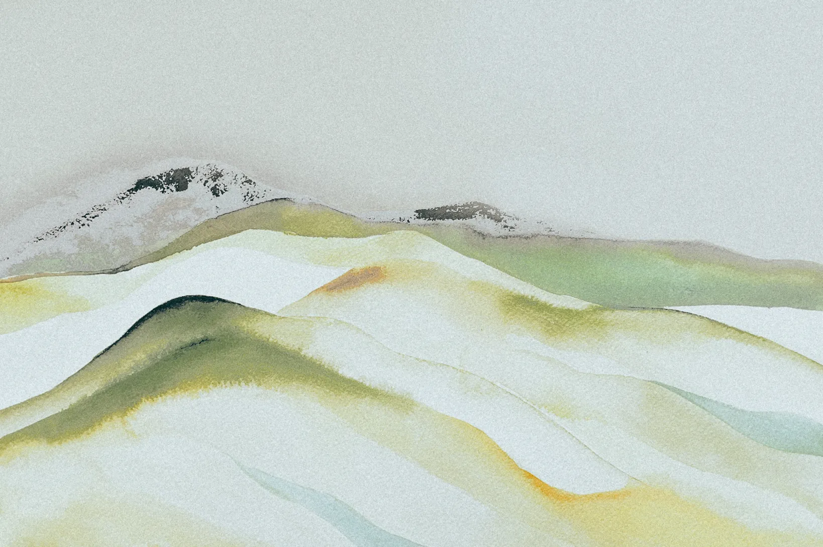
브랜드의 정체성은 상징들로부터 직조됩니다. 부드러운 연필의 여인 일러스트레이션은 제품을 사용하는 감각적인 여정을 보여주며, 한국 대지에서 얻은 조화로운 색감의 아트워크는 브랜드의 전반적인 시각적 균형을 이룹니다. 지류 역시 자연스러운 질감을 선택했고, 차분한 톤앤매너의 섬세한 감성으로 풀어내어 브랜드가 추구하는 정교하면서도 단단한 토대를 완성했습니다. The brand identity is woven through a language of symbols. Soft pencil illustrations portray the sensory ritual of using the products, while artworks inspired by the harmonious tones of the Korean landscape establish a balanced visual system. Natural paper textures and a calm, refined palette complete an identity that reflects the brand's thoughtful and enduring foundation.